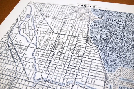
Ever since typography became trendy, more and more typographic maps have been hitting the scene (scene? is there a map scene?). Everyone appears to be so thrilled at the intersection of typography and geography, that sometimes we seem not to stop and look at these maps critically.
An example of this, for me, comes from Ork Posters (find your city here)- who provide an intersection of neighbourhoods and typography. Most of their prints are really cool: good design, and fun and informative neighborhood layout.
Despite their popularity, however, I don’t think Ork maps reach their full potential. All that empty space leaves me wanting. And where’s the lake? And where are the suburbs? In those cities that I am less familiar with, I’m left wanting something else.
And so, I went on a search to find typographic maps that really do it for me. Maps that can integrate typography, but that also give a sense of the city, and a sense of the geography of the urban place. And here are some new finds, and some old favourites.
1. Axis Maps
I love the typographic maps from Axis maps . They focus on street names and transit routes instead of neighbourhoods and it provides a really neat graphic experience. Perhaps sticking to the gird leaves the map a bit sterile, but I think graphically it is much more appealing.
2. Andy Proehl
I discovered Proehl’s set of typographic maps on flickr a while back, and his map of the Mississippi really caught my attention. I love the idea of using typography to map the natural world, rivers, lakes, mountains. I would love to explore this idea more.
I love the use of color in these city maps coming from Seagull’s Hut. The inclusion of a background water color really gives a good sense of the underlying geography. I particularly like this one of Zurich. Color choice leaves a bit to be desired, though.
More Soon.


